
Best Org Chart Design in 2026: Visual Hierarchy, Themes & Modern Layouts
Organizational charts have evolved far beyond dull, monochrome spreadsheets and rigid Visio boxes. In today's distributed, fast-moving workplaces, a modern org chart is an interactive, visually compelling map that boosts cross-functional alignment, simplifies onboarding, and communicates team structure with effortless clarity.
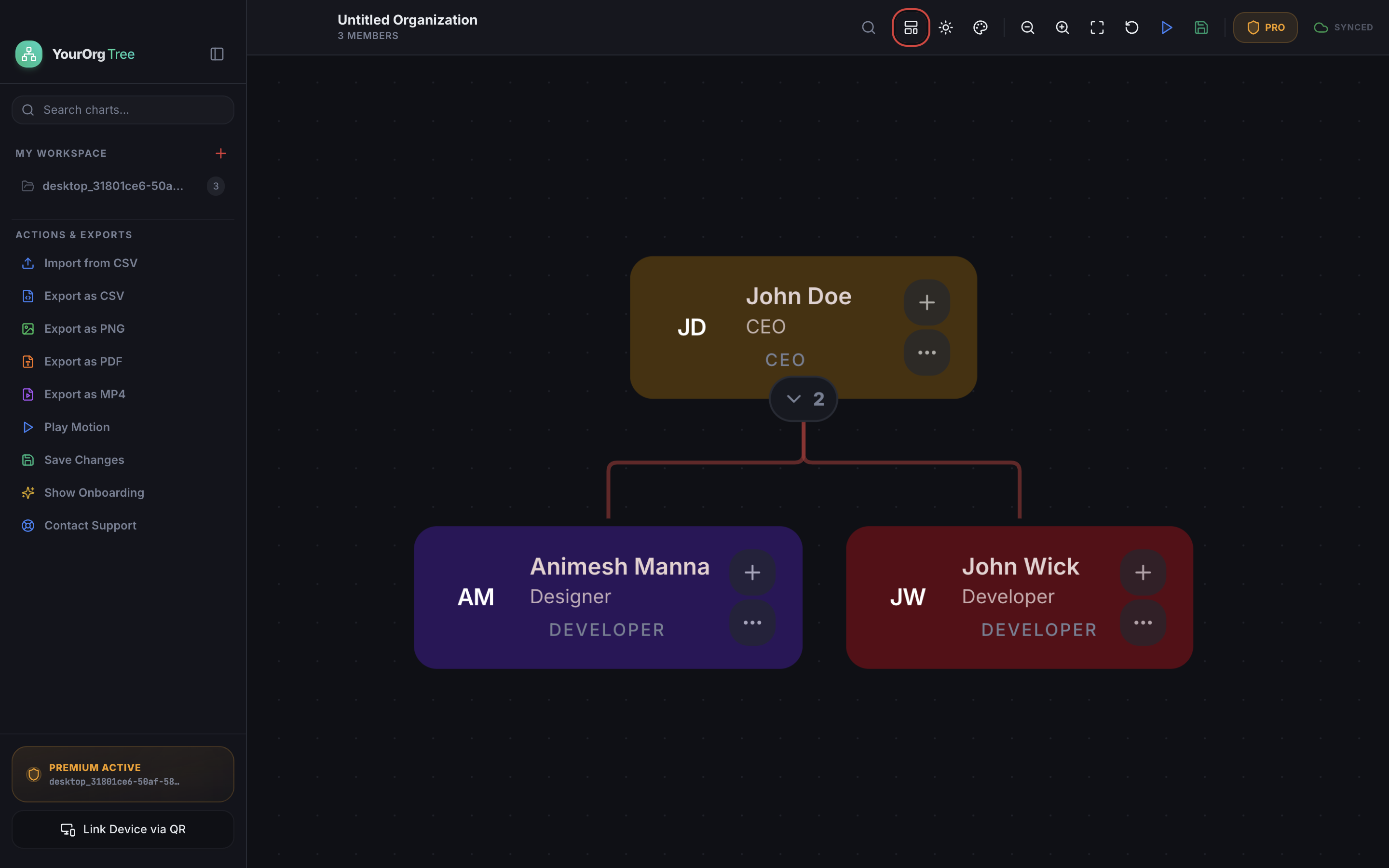
Table of Contents & Design Principles
1. Visual Hierarchy & Reducing Cognitive Load
When a team member or stakeholder opens an organizational chart, their brain must parse leadership relationships within seconds. Poorly designed charts use identical gray boxes with wall-to-wall text, triggering instant cognitive fatigue.
In contrast, high-impact org chart design utilizes three foundational visual principles:
Leadership cards maintain greater prominence with prominent role badges and distinct avatar initials.
Roles are categorized with distinct color accents (e.g. Amber for Executive, Purple for Design, Ruby for Engineering).
A subtle dot grid canvas provides depth and spatial orientation for effortless panning and zooming.
2. The 5 Core Layout Modes: Multi-Directional Architecture
Different team structures and presentation formats demand adaptive layout geometry. Modern organizations rarely fit into a rigid, one-directional box. YourOrgTree provides 5 specialized layout engines that reshape the entire chart with automated collision prevention:
The quintessential corporate reporting structure. Places executive leadership at the pinnacle, branching downward through vice presidents, managers, and individual contributors. Ideal for slide presentations and traditional C-suite reporting.
Optimized for modern 16:9 and ultrawide desktop displays. By expanding horizontally, it accommodates wide teams and deep managerial chains without requiring continuous vertical scrolling or micro-zooming.
Essential for international teams using Right-to-Left writing systems (such as Arabic and Hebrew) and for reverse project mapping where goals stem from target outcomes backwards to initiating roles.
Popularized by servant-leadership philosophies and customer-first organizations. Frontline employees, customer success, and creators sit at the top, supported by leadership and executive enablers below.
Engineered for flat organizations, DAO governance, decentralized squads, and matrix teams. Core leadership or foundational mission values occupy the center hub, radiating outward into functional pods with zero vertical bias.
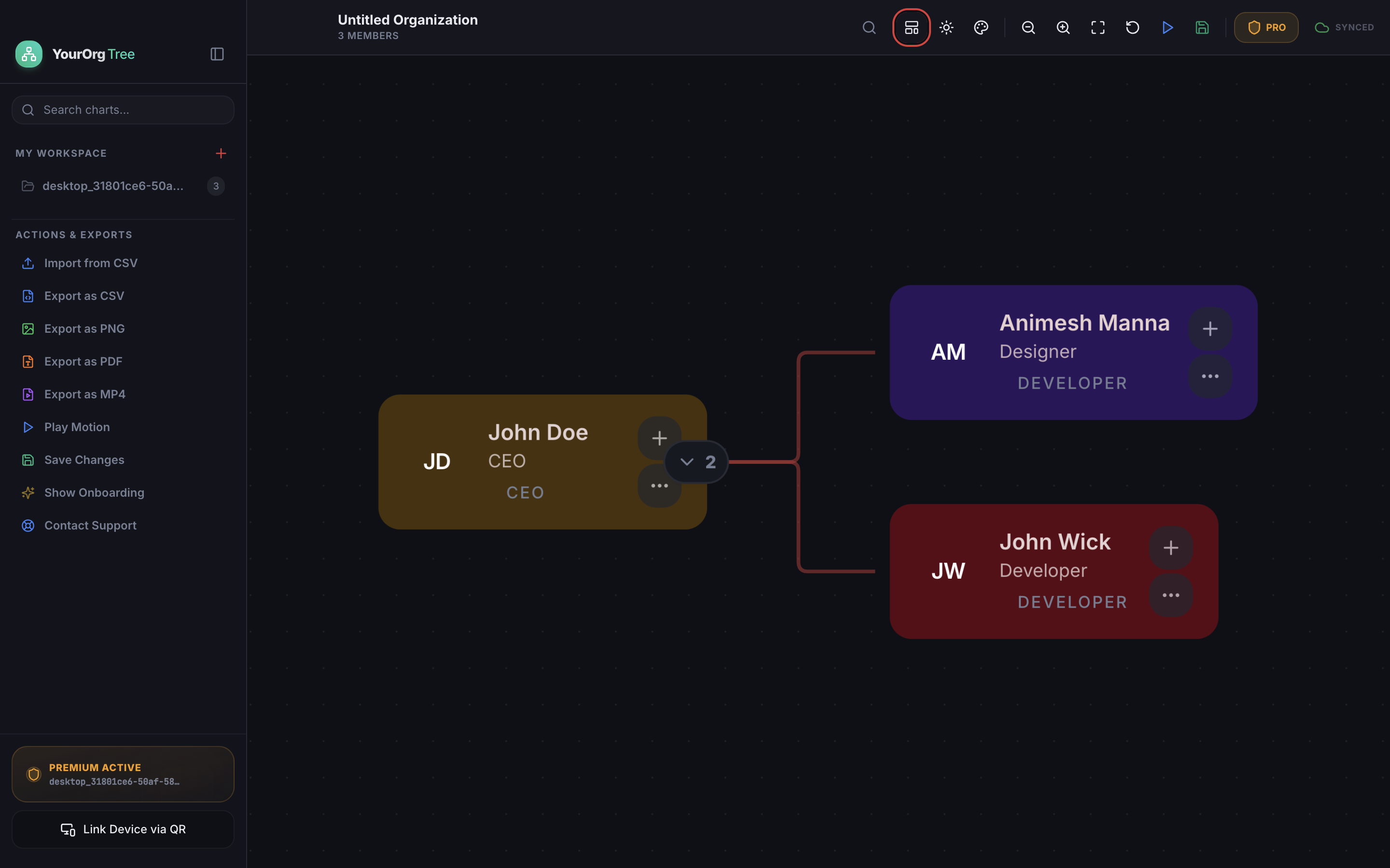
| Layout Engine | Best Application | Key Ergonomic Benefit |
|---|---|---|
| ↓ Top to Bottom | Executive boards, PDFs, formal investor reports | Standardized clarity recognized worldwide |
| → Left to Right | Engineering pods, wide teams, widescreen monitors | Eliminates vertical scroll; maximizes 16:9 space |
| ← Right to Left | RTL language regions & reverse delivery mapping | Native right-to-left optical reading cadence |
| ↑ Bottom to Top | Servant leadership, frontline support & healthcare | Highlights frontline impact supported by leadership |
| ◌ Circular (Radial) | Flat startups, matrix networks & cross-functional squads | Removes hierarchical stigma; emphasizes collaboration |
3. Node Anatomy & Color Psychology
Every node in an organizational chart is a micro-dashboard. The best node designs balance rich metadata with clean negative space. In YourOrgTree, the Node Appearance Customizer allows teams to set precise HEX colors or pick from curated palettes:
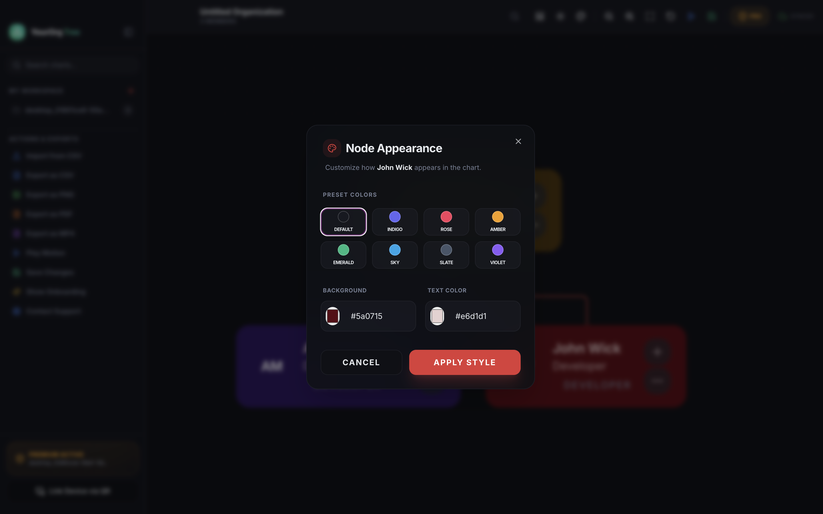
🎨 Best-Practice Color Allocation Guide:
- Amber / Gold (#5a3e10): Reserved for CEO, Founders, and C-Suite Executives for immediate focal contrast.
- Indigo / Violet (#231e54): Ideal for Product, UI/UX Design, and Strategy team leads.
- Ruby / Crimson (#5a0715): High-visibility tone for Core Engineering, DevOps, and Security disciplines.
- Emerald / Forest (#104d30): Calming, recognizable green for Operations, Human Resources, and Finance.
4. Workspace Themes & Dark Mode Precision
Visual fatigue is a major issue when analyzing massive enterprise directories. YourOrgTree incorporates 9 signature themes engineered specifically for dark mode spatial clarity:
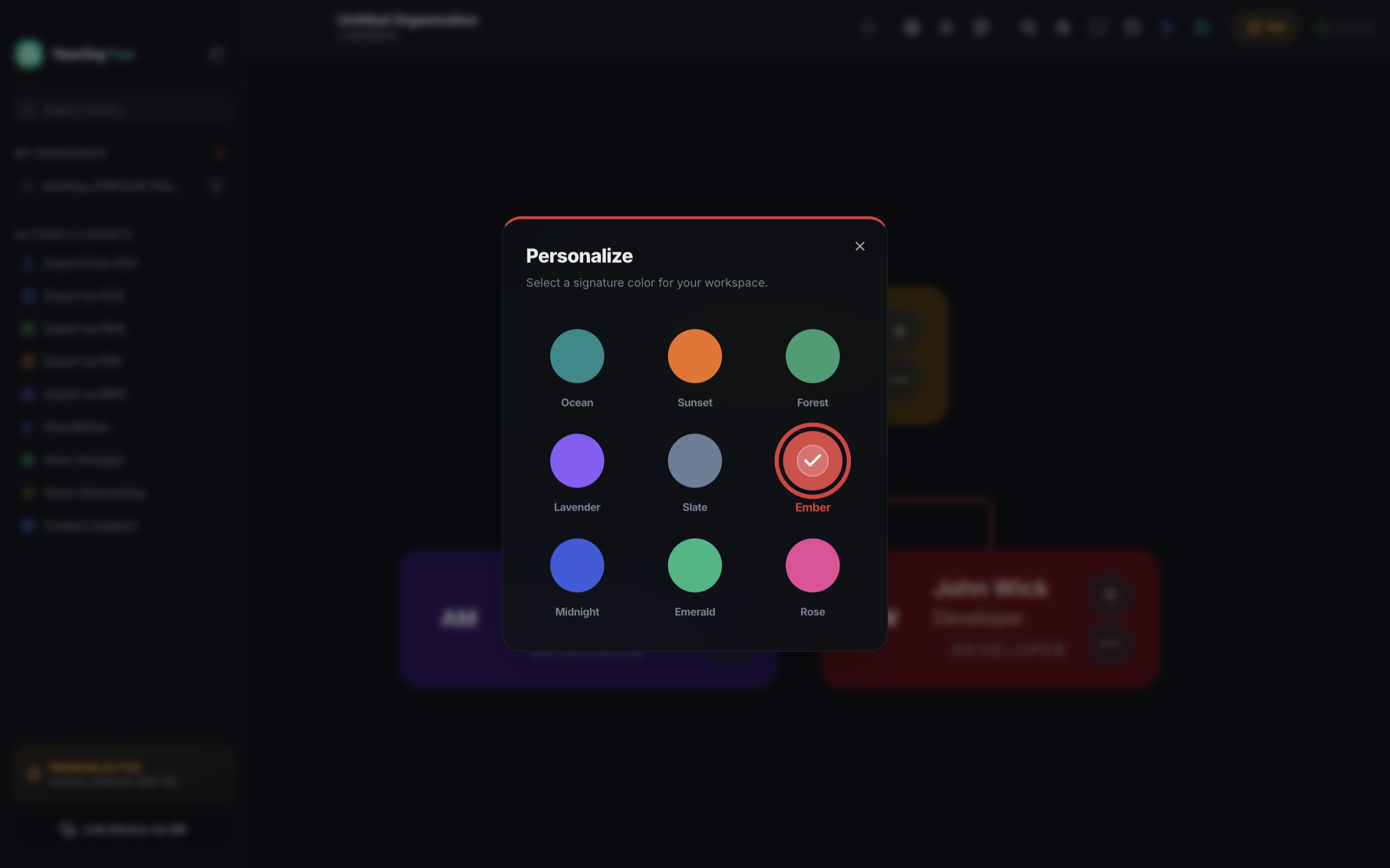
Selecting a signature color tint (such as Ember or Midnight) applies a harmonious ambient glow to all connectors, active selection rings, and workspace badges, ensuring full visual cohesion across every team chart.
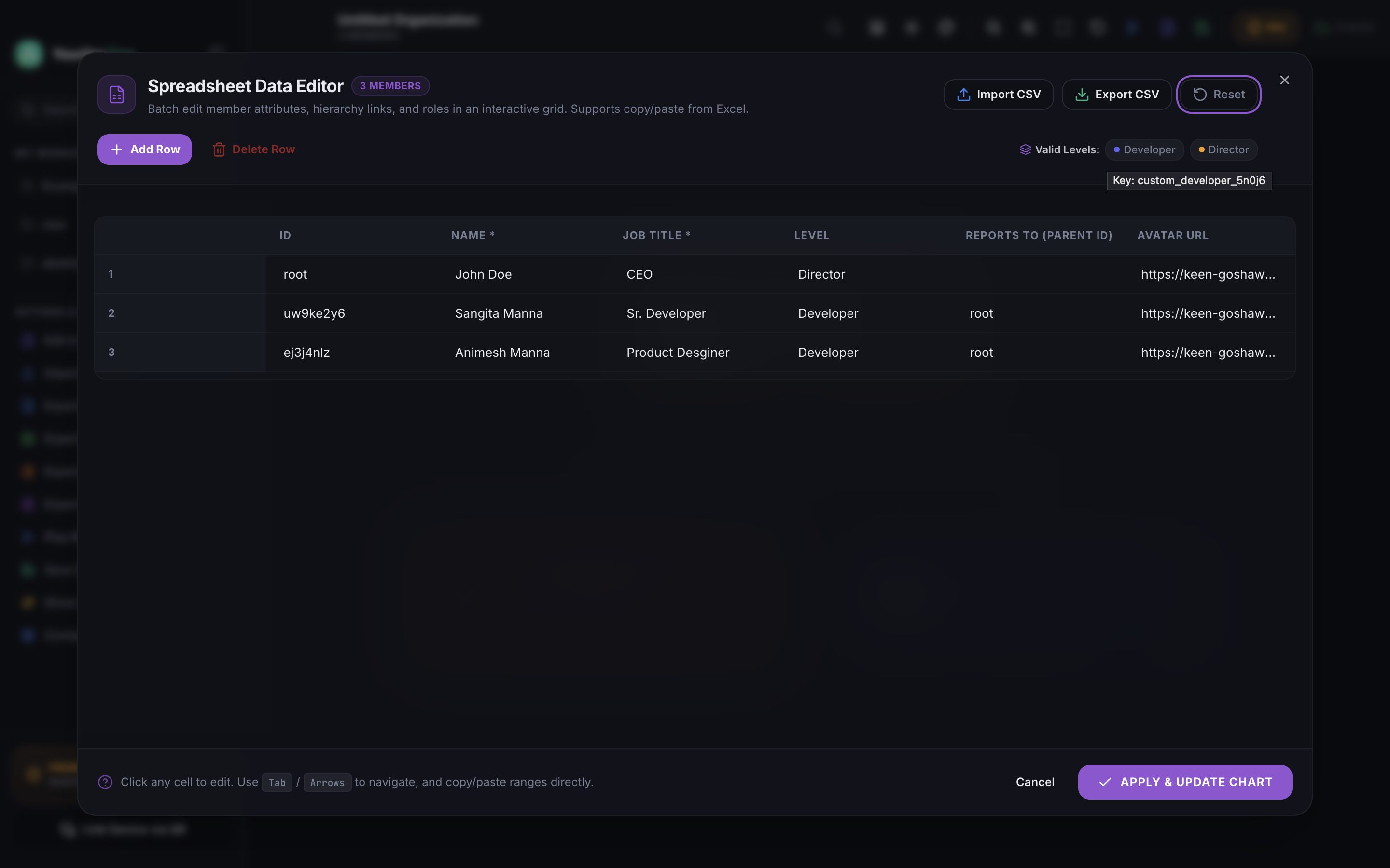
5. Spreadsheet Data Editor & Batch Operations
Managing large hierarchies member-by-member can quickly become tedious. With the Spreadsheet Data Editor, you can batch edit member attributes, hierarchy links, and roles in an interactive grid. It supports direct copy/paste from Microsoft Excel and Google Sheets, keyboard navigation with Tab and Arrow keys, and 1-click CSV import and export.
6. Dynamic Motion MP4 Video Walkthroughs
Static screenshots fail to communicate the dynamic, living nature of expanding organizations. YourOrgTree includes a built-in Motion Video Render Engine that exports 60fps MP4 walkthroughs:
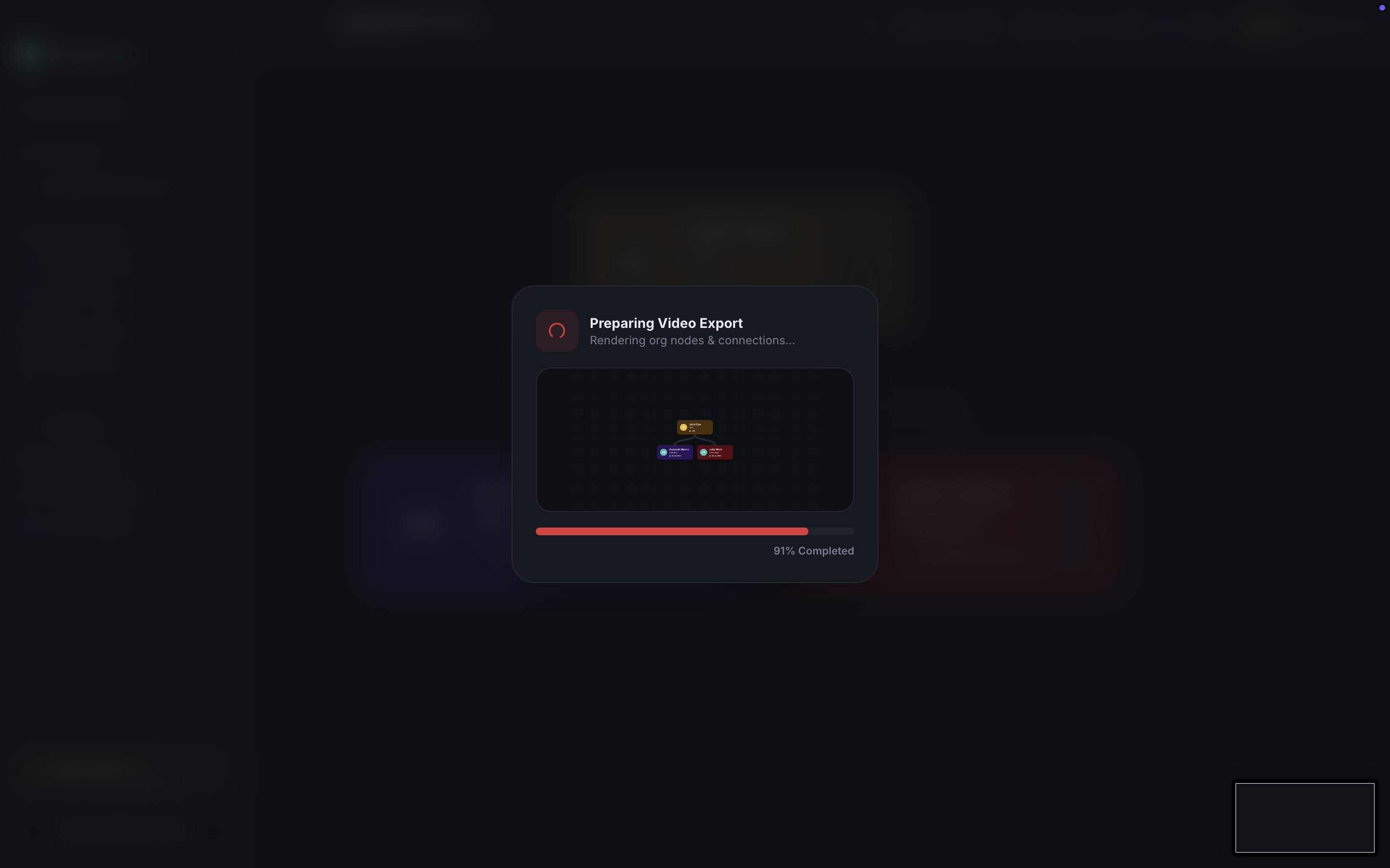
Use motion video exports to elevate executive keynote presentations, create engaging onboarding clips for new joiners, or showcase organizational restructuring to company investors with cinematic transitions.
7. Live Web Link Publishing & Instant Collaboration
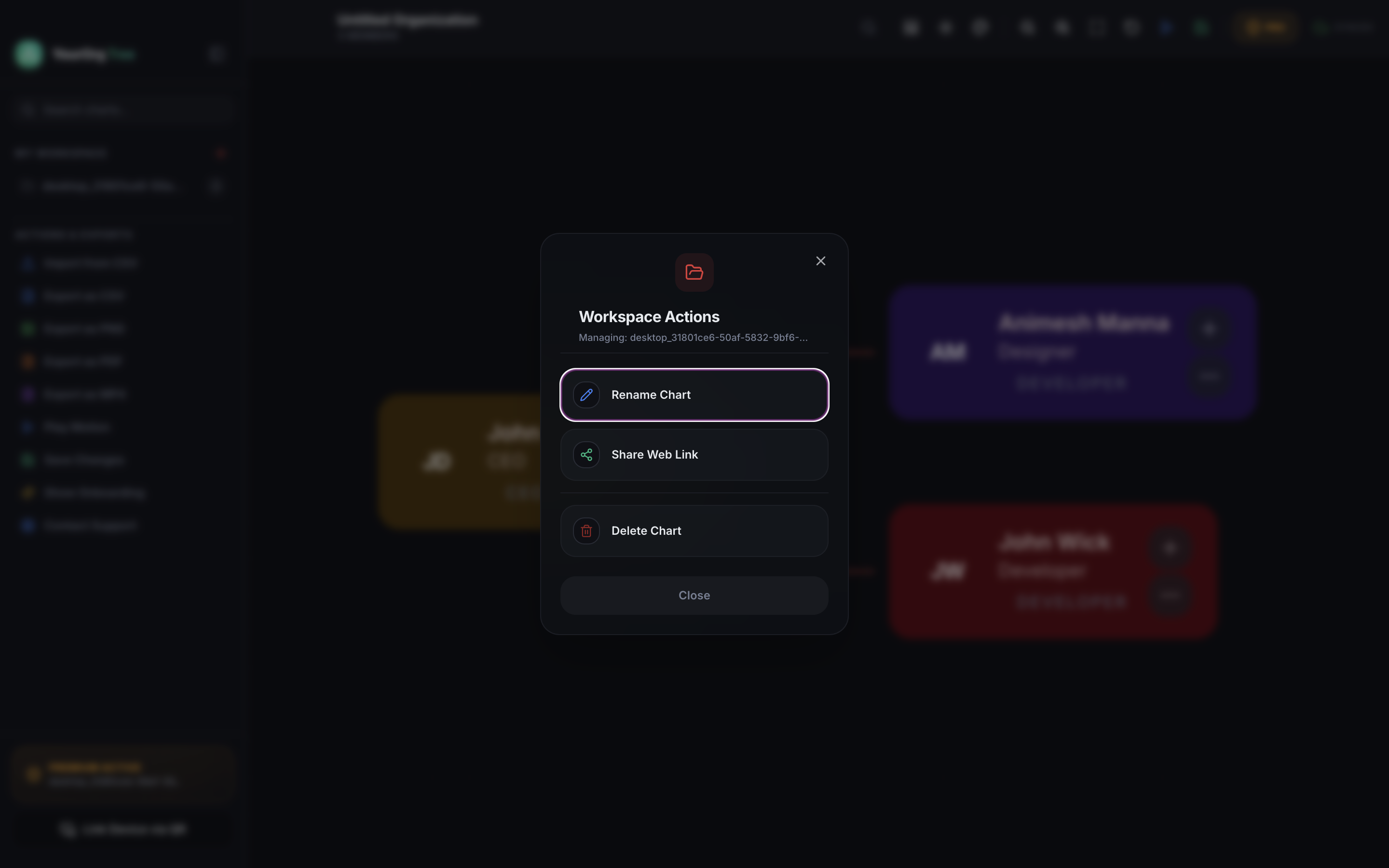
Instead of emailing outdated static PDFs every week, publish a live interactive web link. Colleagues and team leads can pan, search, and zoom through nodes on any smartphone, tablet, or laptop without installing any software.
Experience a Real Live Org Chart in Your Browser
Test the live interactive canvas with node expansion, zoom controls, and responsive styling.
8. Frequently Asked Questions
Q1.What makes a great organizational chart design in 2026?
A great modern org chart prioritizes clear visual hierarchy (distinguishing leadership tiers with contrast), uncluttered typography, adaptive layouts (both vertical and horizontal), intuitive collapse/expand branches, and frictionless export options like motion MP4 videos and live web links.
Q2.Should I use a Vertical (Top-Down) or Horizontal (Left-to-Right) layout?
Use vertical (top-down) for traditional executive reporting structures, slide presentations, and portrait documents. Use horizontal (left-to-right) for broad teams, agile pods, and widescreen monitor presentations where horizontal space accommodates wide spans of control without shrinking node readability.
Q3.How many colors should be used in an org chart?
Limit your core palette to 3 to 4 distinct accent colors. For example, use warm Gold/Amber for executive leadership, Indigo/Violet for Product and Engineering, and Ruby/Rose for Operations. Excessive rainbow palettes create visual noise and increase cognitive load.
Q4.Why is motion MP4 video export better than static PDF org charts?
Video walkthroughs provide smooth camera movements that pan across departments and highlight parent-child relationships sequentially. This is especially effective during new hire onboarding, town halls, and investor pitch decks where viewers need a guided narrative.
Q5.Can I share my org chart without making viewers install software?
Yes! With YourOrgTree, you can publish a live, interactive web link (such as orgtree.app/team). Anyone with the link can pan, zoom, and explore team nodes directly in any mobile or desktop web browser with zero installation required.
Design stunning org charts natively on Mac & Windows
Free to start. Full CSV import, custom color palettes, 9 signature themes, motion MP4 export, and live web link publishing.